How we took the product landing page of a unicorn and boosted its impact by millions of euros.
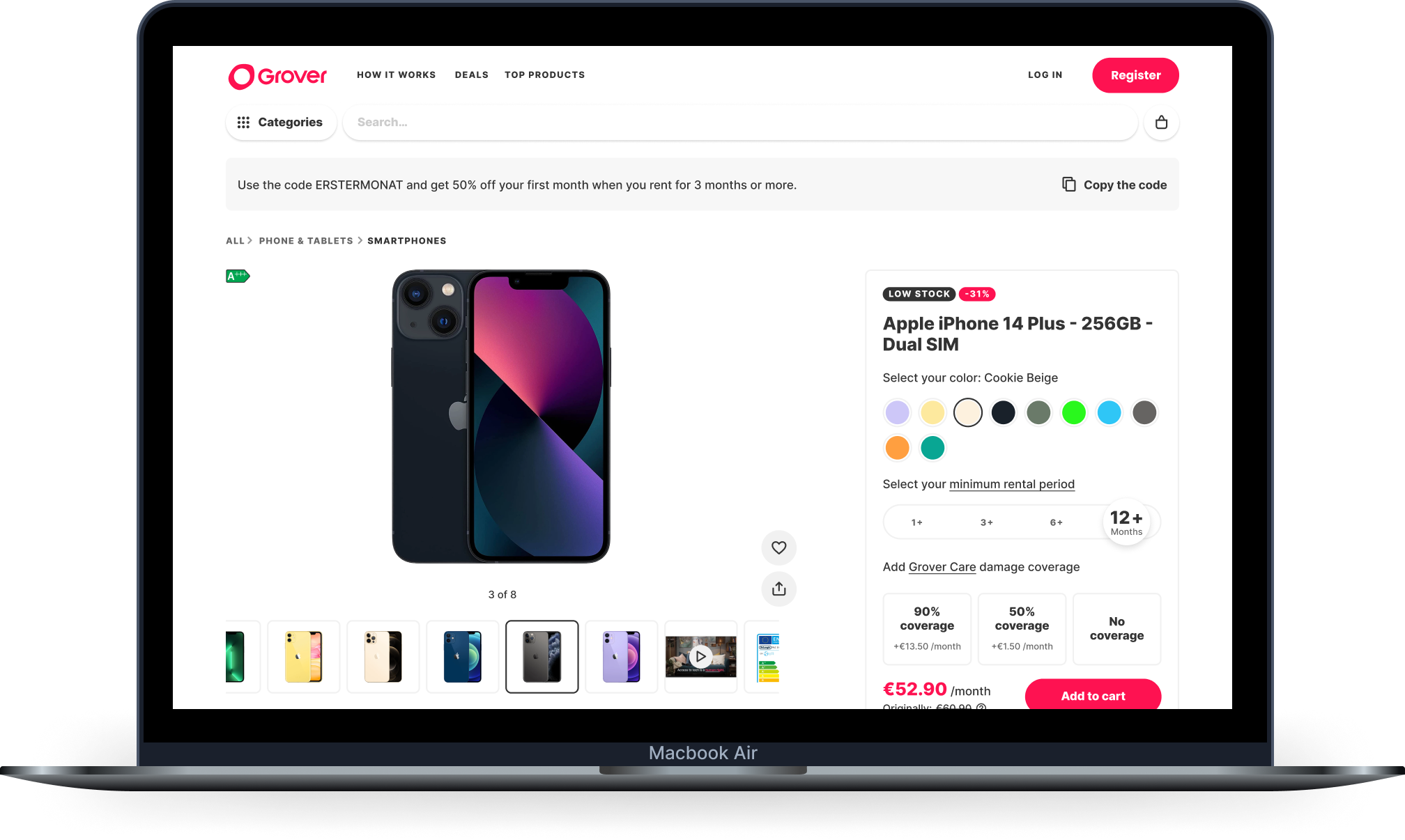
Despite being the most visited page on Grover.com, the product page had very little thought put into it over the years, resulting in a bloated page that wasn't user friendly. There was also close to no research to start this project.
The goal was to improve the conversion rate of the product page, update its look to match the latest design system changes, and make the page more accessible.
A more usable product page that has received praise from our users. We've seen conversion rates increase of more than 10%, equating to millions of euros in new subscriptions.
1 product manager
1 designer
1 content designer
5 engineers
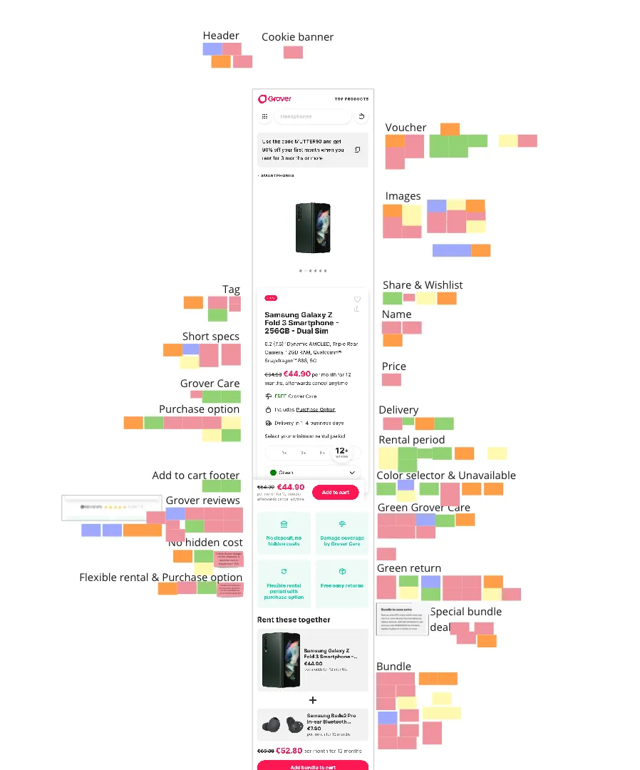
We conducted 5 user interviews to gather qualitative data about the state of the landing page. As you can tell by the image of our Miro board, our users had a lot to say.
We used a software called HotJar to track the usage of our current PDP and determine what our users were doing on the page.
We used a software called HotJat to track the usage of our current PDP and determine what our users were doing on the page.
We ran a card sorting experiment with nearly 200 users to determine the importance of certain elements on the page.
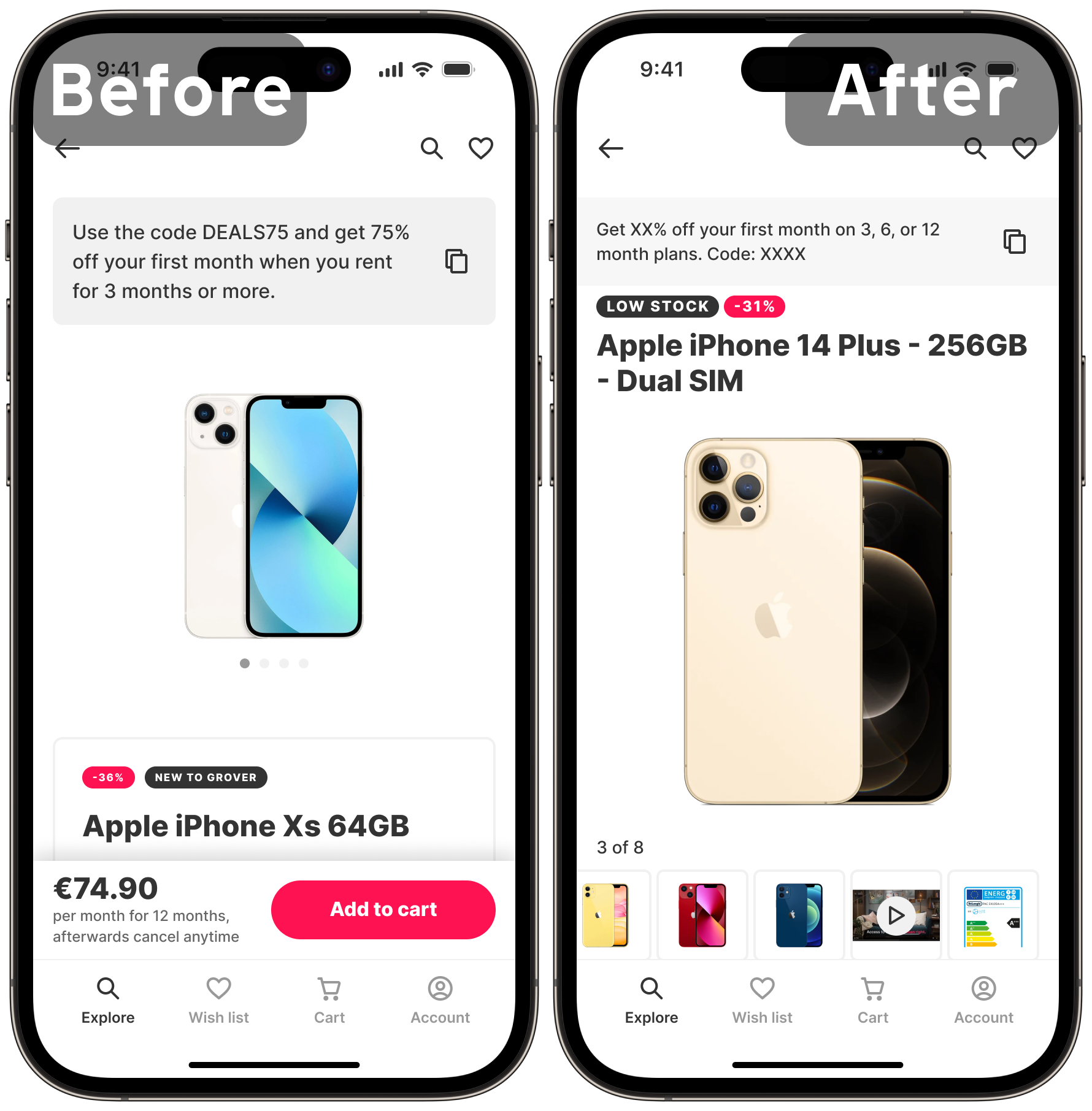
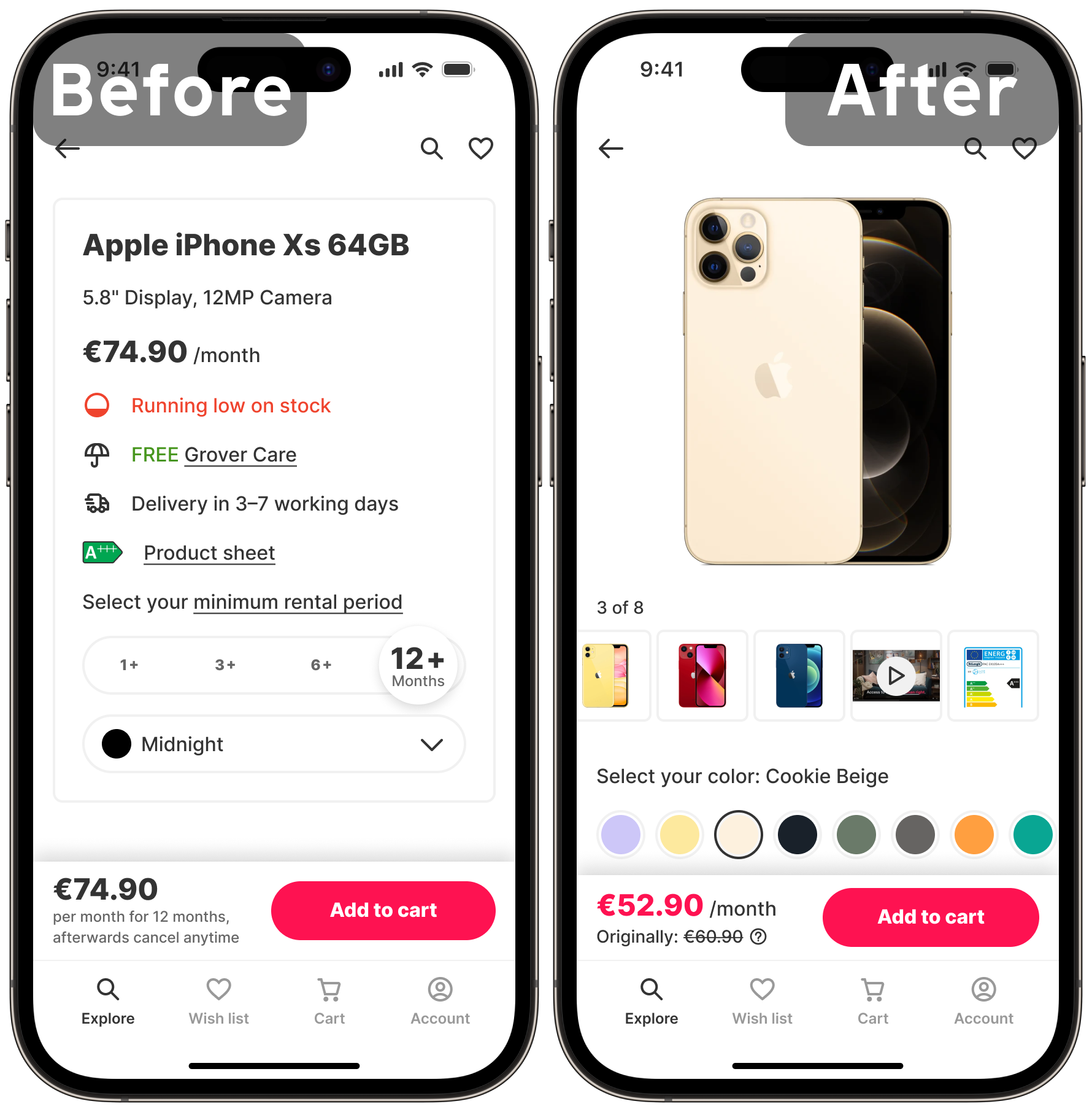
We found during our research that most users never went below the fold, and that 75% of them never scrolled much further than the first component. As such, we focused our effort on what is immediately visible. Certain things were also moved or initially hidden, like the main CTA becoming visible upon scrolling.
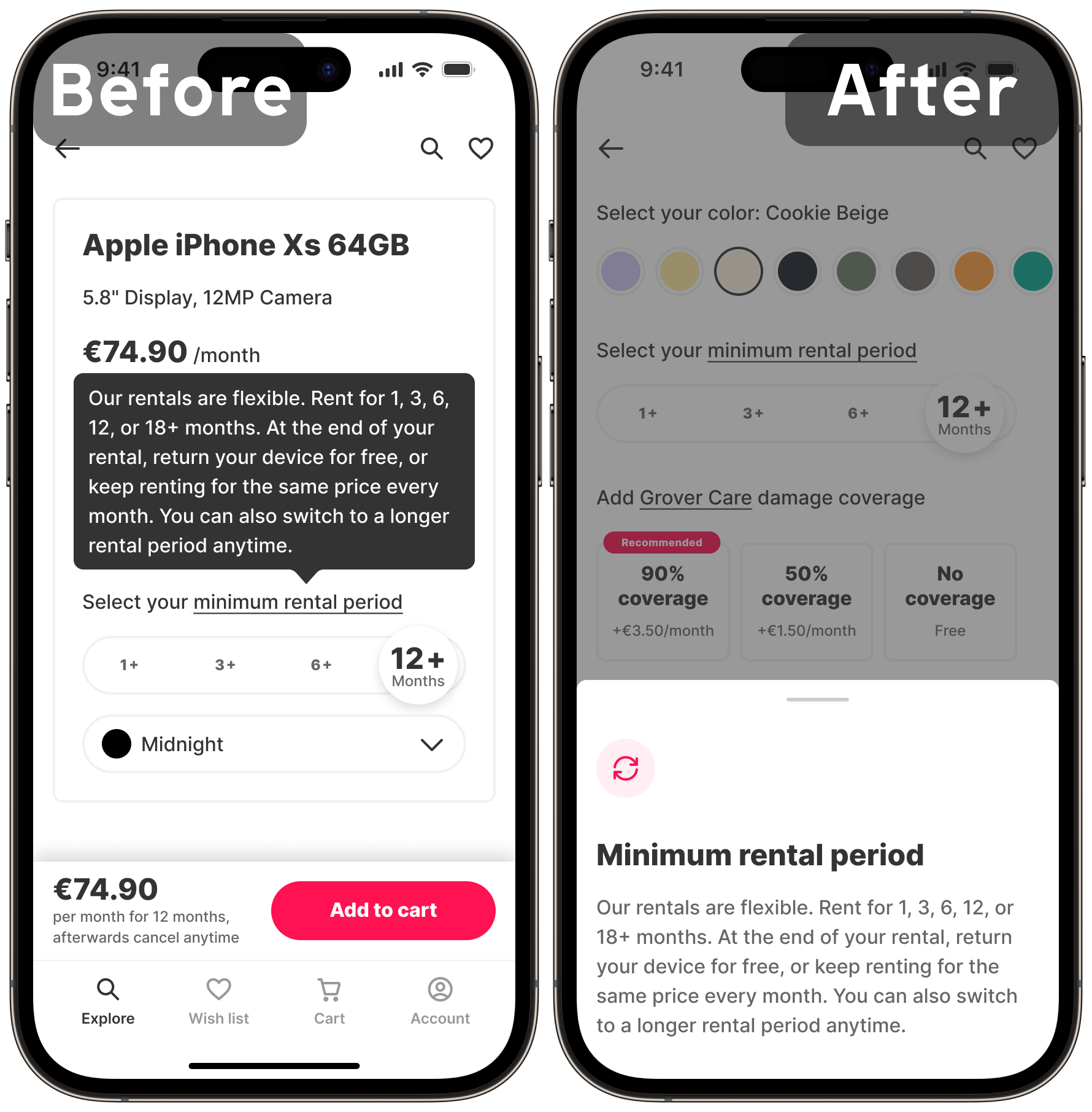
We made several improvements to usability based on the interviews. For instance, the new interface allows users to view the colors and the images at the same time, preview the images in the gallery via swatches, and made the information they want to see more prominent.
We used this time to also improve accessibility. For instance, all interactive areas meet the WCAG AA requirements, and all colors have the proper contrast ratios for example.
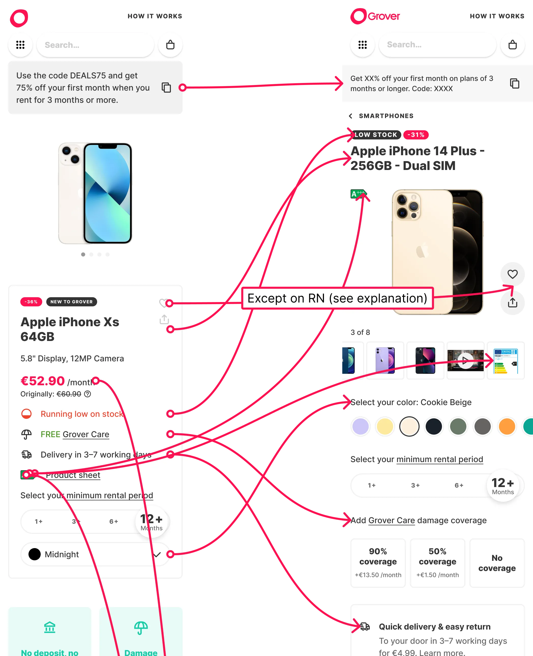
With every user going through this single page, we are tested every change via A/B tests.
We have many plans for the rest of the page, including reworking components to make them less text-heavy and more interesting for users.
For instance, our product description will come directly from the manufacturer with images to make it more visual.
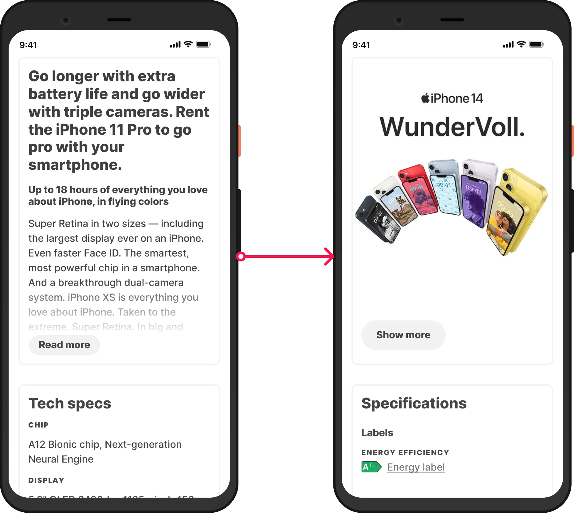
Our users will gradually get access to a revised version of many existing features, as well as new ones.
Meanwhile, we continue monitoring the reception of every change, and doing research to ensure good UX.
